Visit Tolleson
Brand Development

In Tolleson, everyone is familia. Whether dining on the city’s iconic Mexican food, dancing to Latin music at street festivals, or strolling along Paseo de Luces, Tolleson is more than a city—it’s an experience where the warmth of the people and authenticity of the Latino heritage surprise and delight visitors of all ages. Despite this, the city had never taken a tourism-centric approach to its marketing. Working closely with city leaders, the agency developed a comprehensive tourism branding identity that would properly position the City of Tolleson as a vibrant and welcoming can’t-miss destination.
What We Did
STRATEGY
CREATIVE
SOLUTION
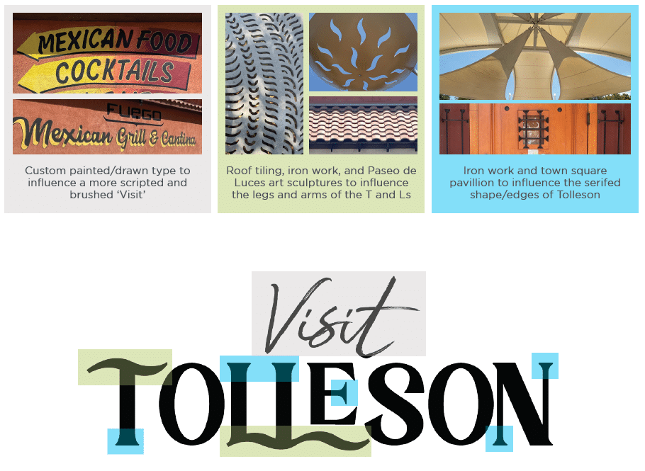
From Day One, this was a fully immersive process for our team. By extensively exploring the city in person, we gained invaluable context about the essence of Tolleson. The team walked the city, capturing firsthand photos of art, architecture, murals, ironwork, hand-painted signage, and mosaic tiling—all of which influenced design choices such as color, typography, graphic treatment, and iconography. This approach was anchored in a research and strategy session with city representatives, delving into Tolleson’s past, present, and future.
DIFFERENTIATING TOLLESON
Though originally founded as an agricultural community, Tolleson has recently capitalized on its proximity to Phoenix to become a thriving hub for warehousing, distribution, and manufacturing. However, our research revealed that this transformation was just one aspect of Tolleson’s growth story. The city had evolved in a remarkably artistic and dynamic way, now offering immersive experiences worthy of interaction. City leaders shared their personal stories with us firsthand, which became the foundation of our approach to branding. Instead of applying a broad stroke, we used these intimate examples to shape our work. ANDERSON aimed to authentically capture the essence of Tolleson, enticing visitors from neighboring areas to discover and enjoy an exciting destination they may not have known was so close by.
RESEARCH & STRATEGY
The 5-hour strategic session outlined what Tolleson was failing to communicate about their amazing city and identified the motivators that would inform our path forward: celebrating a proud Latino culture bursting with authentic food, vibrant art, lively music, and natural beauty. This is more than a community— it’s a warm, welcoming family.
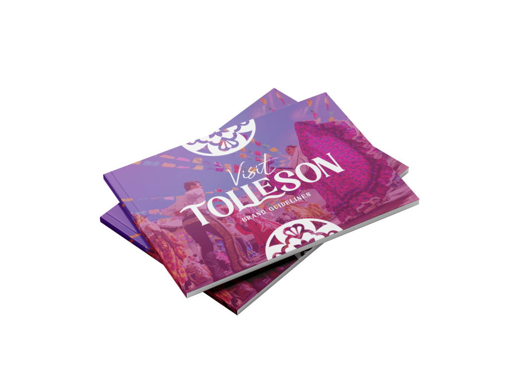
BRAND GUIDELINES
Using the information that came out of our research and strategy session, the agency created a Brand Guide to encapsulate the essence of the city’s identity and serve as a clear and consistent framework for how the brand would be defined, expressed, and represented across all internal and external marketing channels. The Brand Guidelines included:
BRAND DEFINITION
- Tagline
- Mission/Vision/Values
BRAND EXPRESSION
- Positioning Statement
- Voice & Tone
BRAND IDENTITY
- Logo
- Color Palette/Fonts
- Combined Mark
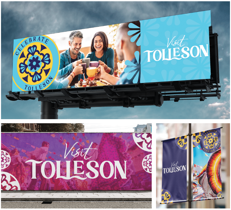
CREATIVE EXECUTIONS
With a comprehensive branding roadmap now established, we set to work on the creative portion of the project. This was a large undertaking with many components.
COLOR & FONT EXPLORATION
Moving away from overtly urban fonts, typography took influence from the hand-painted signs, insignia of the stores, restaurants, murals, and more. We incorporated the bright colors and large shapes the existing art of Tolleson is known for.
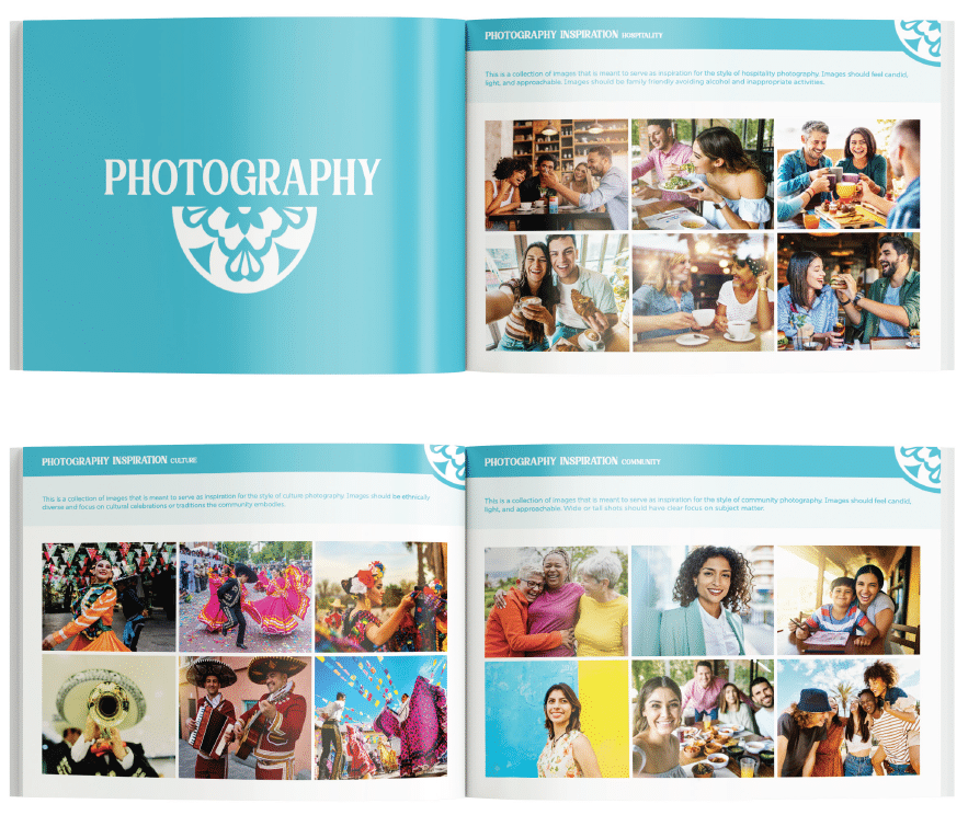
CURATED STOCK PHOTOGRAPHY
ANDERSON’s creative team carefully curated a selection of stock photography that explored the themes of Community, Culture, and Hospitality—the core values of Tolleson’s brand. The images in the collection were chosen to evoke warmth, inclusivity, and authenticity, reflecting the diverse experiences visitors could have here.
LOGO & TAGLINE
The new tagline and logo showcase the vibrant essence of Tolleson, celebrating its unique culture and inspiring visitation for everything it offers: food, events, concerts, and community activities. The campaign strategically intertwines Tolleson’s rich history, lively present, and promising future, positioning it as an inviting community with an enticing story—a place worth visiting.
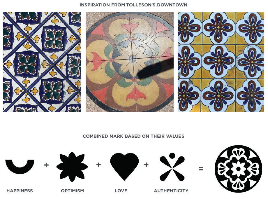
COMBINED MARK
Graphically, the agency created a combined mark—made up of simplified icons that represent Tolleson’s values: happiness, optimism, love, and authenticity. When brought together, it embodies a symbol of the city as a whole. This combined mark can be used on marketing materials as an accent to graphically elevate the brand.
RESULTS
Leveraging a research deep dive that revealed all of the city’s vibrant offerings, the ANDERSON team was able to craft a dynamic tourism brand for Tolleson that celebrates its Latino heritage and welcoming atmosphere—truly capturing the essence of the place. Now, “Celebrate Tolleson” is more than just a tagline, it’s an invitation for visitors to come and immerse themselves in everything the city has to offer.