Summer movie season is in full swing, and anyone living under the hot Arizona sun knows the best way to beat the heat is by visiting a local Harkins theater. From blockbuster remakes like Twisters to indie horror films like MaXXXine to the newest entry into the MCU Deadpool & Wolverine, there’s a wide variety of films to enjoy in the cool comfort of a movie theater.
While escaping the blistering sun is a reason enough to catch a movie, the main way new films attract their audiences is through their trailers. One of the most exciting parts of seeing a movie is getting there early to watch all the trailers that play beforehand—it wouldn’t feel like a complete movie experience without them.
Most people minimize their opinions on trailers to either “that movie looks good” or “that movie looks bad,” but the art of making a compelling trailer can be as intricate as making the film itself. I work with newly released trailers daily as part of the exciting digital displays we create for Harkins. With over 2+ years at ANDERSON and a lifetime of experience going to the movies, I have concluded that a well-edited and effective movie trailer must contain three things: a strong tone, an engaging rhythm, and purposeful shot selection.

Tone
The trailer for George Miller’s Mad Max: Fury Road is an excellent example of establishing tone, vividly showcasing the frenetic energy of its post-apocalyptic landscape. The editing uses frame-skipping, mirroring the film itself. The protagonists and antagonists are clearly defined, and the operatic moments build the momentum of the intense chase sequences throughout the film. Audiences get a clear vision of what the film will feel like, and the trailer gives viewers just enough to hook them but not enough to spoil the entire plot.
Another incredible example of setting the tone correctly in advertising is the Coen Brothers’ A Serious Man trailer. This trailer makes the audience very anxious by using repeated audio motifs to pound into the viewer’s head that the main character is having a very, very bad day. It captures the overall feel of the entire film, and the art of bringing that style into a 2-minute preview is fantastic. On the contrary, a trailer like the one for the 2016 experimental dark-comedy Colossal can honestly be labeled as false advertising. The trailer makes this film seem almost like a romantic-comedy monster movie when, in reality, the film is a bleak, depressing look at an oppressive relationship. The film’s tone wildly differs from the trailer, making it hard to believe that the trailer editor(s) were even given a synopsis.

Rhythm
My favorite part of a good movie trailer is the rhythm that the editor(s) can hit when they use a famous music track or incorporate interesting graphics in some way. David Fincher’s remake of The Girl with the Dragon Tattoo and David Ayer’s Suicide Squad are examples of trailers with unforgettable rhythms. The former features rapid cuts between seemingly unrelated shots from the movie, with huge, bold graphic text, creating an almost whiplash-inducing effect for the audience. This stylistic choice is perfect based on the movie’s vibe and helps to tell the film’s general story without using any dialogue.
In my opinion, the latter is one of the best-edited trailers in recent blockbuster history. While the quality of the film itself is questionable, Suicide Squad garnered massive amounts of excitement online and in theaters purely off the first trailer. The gunshots blasting on the beat of the music, the shell casings landing with the drum fill, and the picture cutting to the glorious sound of “Bohemian Rhapsody” makes for one of the most engaging trailers at a time when superhero films reigned supreme. Compare modern trailers like these to a trailer such as the one for Robert Zemeckis’ Cast Away, and it’s clear how far trailer editing has come as an art form. Cast Away is about a man whose plane crashes onto an island, and he must survive, but from the trailer, you would think it’s mainly about a FedEx employee. There is no rhyme or reason for the cutting in the trailer, and simply floating from scene to scene feels incredibly odd.
Shot Selection
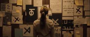
Arguably, the most critical part of crafting a compelling trailer is selecting the right shots without giving away too much. Longlegs is a horror film coming out this summer with a trailer that makes my skin crawl. The way the trailer editor(s) focus on only a handful of shots, cutting between them and overlaying bright red text, along with the audio of Nicolas Cage’s terrifying breathing, makes for one of the creepiest and most unique trailers I’ve seen in a long time. The viewer knows almost nothing about the movie based solely on the chosen shots, but it’s just enough to make anyone wonder what could happen. If the film is as scary as its advertising suggests, audiences are in for a terrifying time.
Conversely, one of the worst trailers for a blockbuster film I have seen is the one released at San Diego Comic-Con for Zack Snyder’s Batman v Superman: Dawn of Justice. The original cut of the trailer was nearly six minutes long and gave away practically every detail, including Wonder Woman’s appearance, the main plot points, and even the final battle scene against the monster in the film. The decision to include these shots baffles me—the trailer lays out every significant event in the movie. Giving away the story through the shot selection kills any excitement audiences may have had and gives them a reason not to see the film.
Cut to the Chase
A purposeful, well-edited movie trailer does much more than not spoil the ending. It’s the primary art form used to advertise a film to audiences that would otherwise not know about upcoming theatrical releases. So, when the task of getting butts in seats lands on your plate, why not make it memorable?